Yes it's been awhile... but I don't always have something interesting to say. Sometimes life just continues on, and while there are moments I continue to appreciate (many many of them); they are often - individually - brief and fleeting, and not really worth the time to write about. So yes, it's been awhile, and I'm sorry about that, but I avoid drama - mostly - and so I'm often a pretty "boring" person to anyone besides myself (I mean, I find myself very interesting all the time... but that may just be me).
Anywhoodle, so a quick word (or two):
First, I'm going to see Earth tonight. I'm very excited for this, and I can tell you that you will be hearing more about it once I've seen it, both on my blog and in person. I'll be repeating my excitement/opinion on it a lot I'm willing to wager, so if you hang around me often, be prepared.
Secondly, I put up our pendant lighting last night. Russ was kind enough to assist* me (*read: do it while I stood by holding tools and "looking" helpful) in installing the canopy/rod system that you mount to the ceiling, over Easter weekend. I picked up the lights this last Monday, and last night spend a great deal of time going through the process of installing them.
It's a very very very very tedious task. Seriously. (No, seriously. Just ask Wendy.) But finally, I got them exactly how we want them, and they're up and running! Yeay!
Thursday, April 23, 2009
Quick and to the point
Posted by
Noblekain
at
9:59 AM
4
comments
![]()
Thursday, April 2, 2009
Typography - dashes
This will probably bore many of you, so I'll keep it as short as possible, and stick to linking to topical info, rather than quoting.
That prefaced, I've been inspired to research — and now attempt to properly use — typography correctly (in this case, the dash and quotes).
Ever notice when typing in MS Word, that sometimes when you type a dash and follow it with a word, MS Word will replace your hyphen with a longer looking dash?
Or, perhaps you were looking at your "Character Map" program in Windows, or one of the Wingdings fonts, and noticed that there are a number of different looking dashes?
Maybe you've noticed that this "quoted text" (produced by the double quote on the keyboard) is different than this “quoted text”
Apparently, in typography, there are clearly — or perhaps not so clearly — defined rules on when a type of dash/quote is intended to be used. Who knew? I always thought that the ones that are available on the keyboard are the right ones.
So how and why did I go about looking at this?
Well, as you know I'm a programmer, so I often will use special characters for my work. Additionally, I'm always reading articles, and using tools to make my programming easier.
Today, I came across this: http://www.smashingmagazine.com/2009/04/02/typography-keyboard-layout-download-now/
“Really cool”, I thought, since many of those characters I use for the websites I make. As I read about the tool, I was feeling slightly reproached, since the blog author begins by making clear the habits of good designers. Apparently, I have some bad habits!
Anyway, this lead me to look into perhaps the most odd and confusing of the rules: the rules regarding dashes. Where did I turn? Why, to my good friend, The Wiki, of course!
If you're so inclined, read this here about the dash, em-dash, en-dash, and minus.
http://en.wikipedia.org/wiki/Dash
Interesting stuff... at least I think so.
Posted by
Noblekain
at
12:58 PM
2
comments
![]()
Wednesday, April 1, 2009
MBA - Me Be Awesome
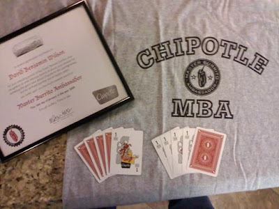
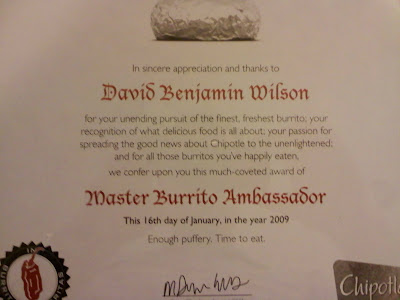
That's right... I've now officially joined the ranks of the Awesome - the MBA's. For you other wee little people, who are clearly unenlightened, an MBA is a Master Burrito Ambassador.
For your enjoyment, here's a little taste of my official adoption into "the group".
The Gear

The Certificate

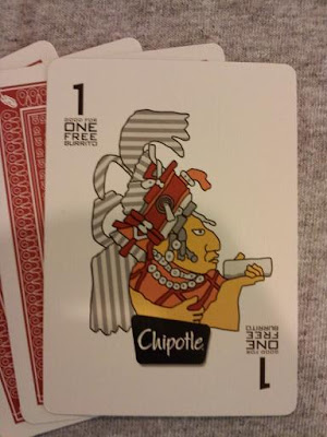
The Cards

Posted by
Noblekain
at
6:37 PM
2
comments
![]()


